Reimagining Shanghai Disney Resort’s Digital Front Door
Product Strategy · Consumer Experience · Business Impact
From an in-park utility to an end-to-end guest companion.
When Shanghai Disney Resort opened in 2016, its app was a Mandarin version of the Disneyland app in the U.S. The technology stack was also based in the U.S., making even relatively small changes expensive in both time and effort.
More importantly, the experience wasn’t designed around the expectations and behaviors of our guests in China.
By 2021, we had an opportunity to rethink it from the ground up.
Our ambition wasn't simply to give the old app a new look. We wanted to build a digital platform that could evolve quickly with the needs of our guests, business, and park operations—and create an experience that Chinese guests could use with confidence.

One app. Three very different needs.
The redesign had to solve for three perspectives simultaneously.
For our guests — extend the journey
The original app was designed primarily as an in-park utility.
But a Disney trip starts long before a guest walks through the gate—and doesn't necessarily end when they leave.
We reframed the experience around the entire guest journey:
Before the visit
Discover → Plan → Buy → Prepare
During the visit
Navigate → Experience → Decide → Purchase
After the visit
Remember → Revisit → Stay connected
That meant reconsidering not just the interface, but the role the app should play throughout a guest's relationship with the resort.
For the business — make digital a stronger channel
The new app also needed to do more for the business.
We wanted to increase in-app ticket and pass sales and make digital-exclusive offerings—including Disney Premier Access—easier for guests to discover and purchase.
Instead of treating commerce as something added around the park experience, we needed to think about how it could become a natural part of the guest journey.
For operations — design for change
Running a theme park means things change constantly.
Our previous architecture made updates costly and slow. So flexibility became part of the product strategy itself.
We introduced more configurable modules that allowed operational teams to adjust content and experiences more efficiently—without requiring every change to become a major product or development effort.
And one more challenge: make it feel authentically Disney, distinctly Chinese
Chinese guests brought different expectations around information density, navigation, commerce, promotions, and digital behaviors. Simply translating an experience designed for American guests wasn't enough.
But when we leaned too far into familiar Chinese digital patterns, we risked losing the simplicity and distinctive visual character of Disney.
The answer wasn't to choose one or the other.
We needed to find the right balance—combining the clarity and richness Chinese guests expected with the simplicity, storytelling, and brand expression that make an experience feel distinctly Disney.
That balance shaped both the UX architecture and the new visual language we developed for the app.

Sophia presenting “Designing for the Chinese Market” at the Disney UX Summit
“Authentically Disney, Distinctly Chinese” wasn’t just a philosophy for designing the park—it became a guiding principle for how we designed our digital front door.
Designing for the moment, not just the user
One of our first decisions was to rethink the app navigation.
Previously, guests had to navigate through the app to find many of its most important features. We brought key actions and information directly to the homepage—but quickly realized that simply putting more on the homepage wasn't the answer.
A guest planning a trip from home has very different needs from someone standing inside the park. And an Annual Pass holder may be looking for something different altogether.
So instead of designing one homepage for everyone, we designed around guest context.
We created three distinct homepage experiences:
Pre-Park — planning, preparation, tickets and information before arrival
In-Park — attractions, wait times, navigation and experiences happening now
Annual Pass — benefits, offers and content relevant to Passholders
Using location and guest-profile information, the app could identify the guest's context and surface the most relevant experience by default.
Instead of asking guests to find what mattered, we wanted the app to understand what was likely to matter to them now.
This approach also helped us balance richness with simplicity.
Rather than surfacing everything a guest might need on one homepage—a pattern common in many Chinese apps—we used tabs to curate content based on the guest’s context.
Guests saw what was most relevant first, while still having a clear path to explore everything else.
We didn’t reduce the amount of information. We made the information feel simpler by showing it at the right moment.

Designing information around intent
We applied the same principle to attractions.
Rather than treating every piece of information as equally important, we asked:
What does a guest need at the moment they're deciding what to do next?
For an attraction, wait time was one of the most important pieces of information.
And that gave us another insight.
A long wait isn't just information—it creates a decision.
Wait 90 minutes? Or find another way to experience the attraction?
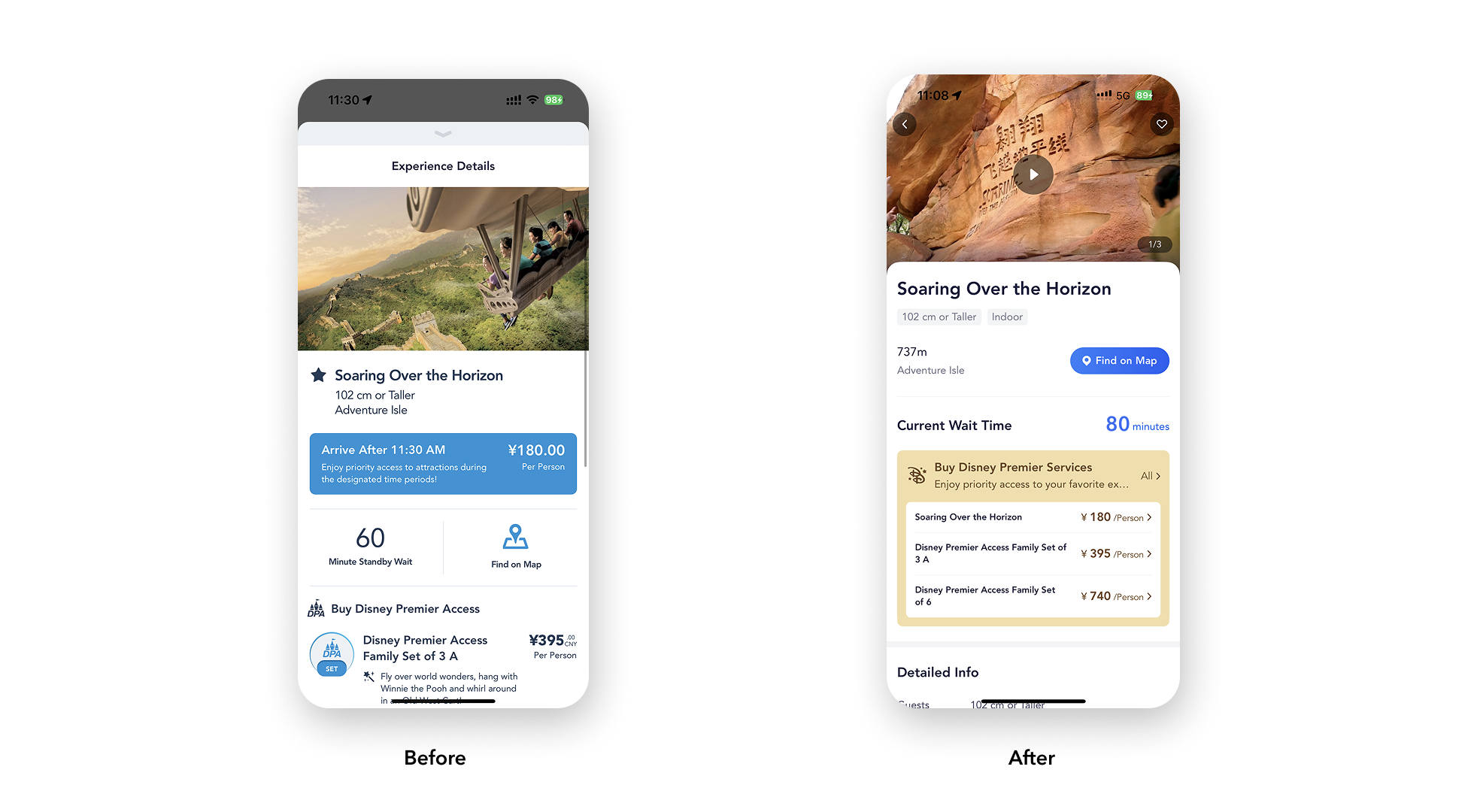
Disney Premier Access allows guests to reduce that waiting time. Yet in the previous information architecture, the product and the problem it solved weren't presented together.
We restructured the attraction detail page and placed Disney Premier Access directly below the wait time.
Wait time → Premier Access → decision
By connecting the guest's immediate need with a relevant solution, Disney Premier Access conversion increased from 30% to 60%.
Consistency without sameness
This created one of our hardest design problems.
Shanghai Disney Resort contains hundreds of points of interest across very different categories:
Attractions · Dining · Entertainment · Shops · Guest Services
Each requires different information.
A dining location might need signature dishes and coupons. An attraction needs wait time, height requirements and Premier Access. A show needs performance times. A service location may need eligibility or instructions.
We couldn't force every destination into exactly the same template.
But if every category behaved completely differently, guests would have to relearn the interface every time they moved between them.
So we created a shared information architecture with flexible content modules.
The underlying hierarchy and interaction patterns remained familiar, while individual categories could surface the information most relevant to that particular decision.
Consistent enough to feel familiar.
Flexible enough to be useful.
And that approach gave us something equally important for the business: a system that could evolve as new operational and commercial needs emerged.
A foundation for what comes next
The revamped app changed more than the interface. It expanded the app from an in-park utility into a platform that could support guests throughout more of their journey—from planning and purchasing before their visit to making decisions in the park.
The results also showed us that designing around guest intent could create value for both guests and the business. Ticket and pass conversion increased, Disney Premier Access conversion grew by 50%, and guest feedback and subsequent research showed that the richer, more contextual experience gave Chinese guests greater clarity and confidence.
But perhaps the most important outcome was the foundation we created. A more flexible architecture gave our teams room to respond to changing operational and business needs, while the new experience opened opportunities to extend the guest relationship beyond the park visit.
And it wasn't the finish line. As guest expectations, business needs, and the park itself continue to evolve, so will the experience.
The redesign wasn't about making the app simpler. It was about making a complex experience feel clearer, more relevant, and more useful at every moment.